How to use Iris MA’s colour chart
Drawing on the brand’s experience in collaborating with color professionals and in numerous projects in different countries and cultures, the Marius Aurenti color chart is now called IRIS.
IRIS, because color only exists through the perception of your eye, IRIS, the goddess of the rainbow in Greek mythology.
This IRIS color chart is a real choice, illustrating values as close as possible to natural colors, the best pigments and harmony with Nature and the environment.
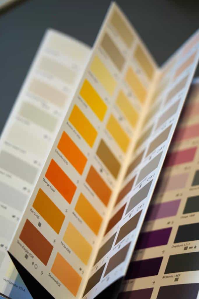
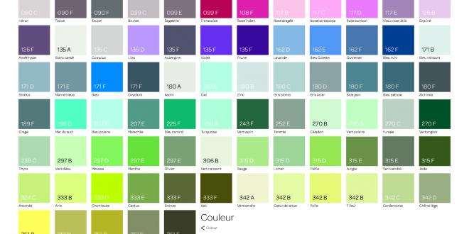
Each color has a name, a number and a letter.
These three elements inform you of the color (the name), chromatic composition (the number) and brightness (the letter).
This classification has been designed to help you with your chromatic compositions and color harmonies.
The name of the color evokes its universe and a certain collective memory, which makes up our chromatic culture.
The number is the indicator of the hue in the color wheel.
A circle starts at angle 0 and reaches 360° with the complete turn.
This circle is the space of the 4 key colors: yellow 0°, red 90°, blue 180° and green 270°.
So, the number of a color will tell you a little about its hue: a color with the number 45 is halfway between yellow and red, for example, and a color with the number 180 is a blue hue.
As there’s more to color than hue, luminosity sums up pigment content (saturation) and clarity. So a 180 A color will be bright and clear, while a 180 D color will be very dark.
This choice allows us to understand the mathematical dimension of color and harmony.
A cameo, for example, will feature colors with close numbers, while sharp colors will have very different numbers.

This construction also gives you a legal value in the French building industry as to the possibility of using this or that color.
Since color is a source of light absorption or reflection – and therefore of heat – the rules governing the Y value (known as luminous luminescence) must be respected.
To simplify this, we have created brightness classes ranging from A to E for all Marius Aurenti colors.
Colors with the letters A, B, C and D are suitable for outdoor use in France. Shades A, B and C are suitable for outdoor use in regions with strong sunlight, the South and the tropics.
The Iris color chart features whites and faux whites in a wide range of very light shades, imagines multiple grays, sophisticated beiges, precious taupes, revisits intense colors and acid pastels.
Some Iris colors can be painted with mineral paints (lime, silicate), while others can be painted with organic paints.
This color chart is a revolution, as it also allows for chromatic research and harmonies in all materials.


